The Computer Center

The Data Center of the Universität Regensburg is the central service provider in all matters of information and communication technology.
Teaching staff, researchers and students of the University of Regensburg are to be optimally supported by the provision of a wide range of basic services as well as central procurement services of software and hardware.
output
The complexity of the data center's services demands it's own web presence and provides direct access to the numerous, diverse target groups. However, an accumulation of content over a long period of time and historically grown structures can lead to problems such as duplications or misleading nesting. Further was the fact that different units were responsible for maintaining the website. There was no central point of contact for inquiries. This situation made it increasingly difficult to find relevant information. Consequently, user-friendliness also suffered from this.
WHAT ACTUALLY IS AN INFORMATION ARCHITECTURE?
An information offering (i.e., the entire website) includes the information architecture, which combines content, navigation paths, and search or access options. An essential part of this is the interaction with the user. The usability of the offer is the first priority and should be designed as target group-oriented and user-friendly as possible.
A new project
Something urgently needed to be changed about this situation. Target groups should be able to reach their destination quickly and easily without having to go through three or more levels, only to discover that the result is still not the right one. But where do you start to restructure such an empire of pages and content?
Our website has grown continuously over the past few years and was hardly manageable for us editorially; visitors were downright overwhelmed with content. In particular, the redundant distribution of content across different page areas made it difficult for our visitors to find the content they needed. Due to the complexity of the project and in order to avoid losing our way through the "Data Center glasses", we brought in support from an experienced agency.
At the beginning, it was difficult to get a meaningful overview at all. A detailed analysis of an existing structure and especially the content takes a lot of time. We created a large list in which content was evaluated and keyworded. That was then the basis for further concepts.
Conception
In parallel, the existing navigation structure was analyzed. More than seven menu items ruled the pages and did not make it easy for so-called "click-seekers" to reach their destination.
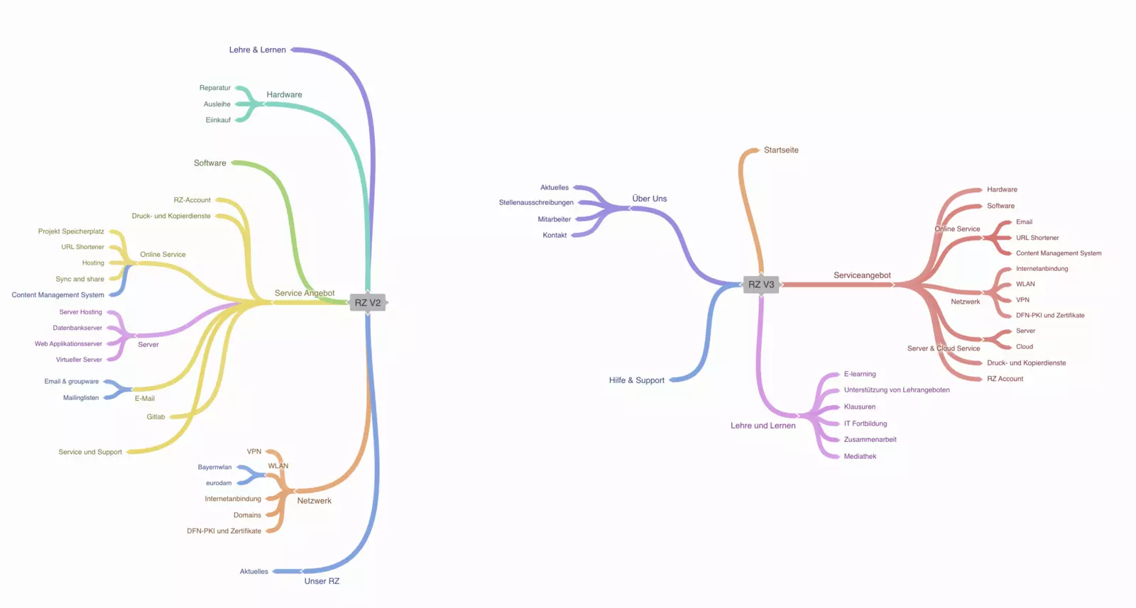
With the help of an online mind map tool, the first step was to visualize the current structure. Here it was possible to illustrate the extent of the structure.
Based on the current state, we developed a target state or an improved version in the second step. After several feedback loops, we agreed on two favorite structures, on the basis of which we could now initiate the next steps.
Tests
In order to test which structure ultimately offers the user a good user experience, we conducted user tests with employees and students of the University of Regensburg and in2code.
Both structure proposals were integrated into the existing TYPO3 system and then ten tasks were set up for each structure. The test persons should work through these.
For example, target pages were defined that the testers should find. The time it took for each person to reach the specified page was closely monitored. Finally, each test person gave a clear conclusion on both structures and evaluated them in comparison.
It was exciting to observe how each respondent found a different path to their commissioned goal and also experienced the structures differently. The importance of user experience and usability was again strongly demonstrated to me here. So if anyone is also facing an outline of their information architecture, I can only recommend user testing to them!
EDITORIAL GUIDE
In order to avoid creating and maintaining pages twice in the future, we had to create a solution that would serve as a support and guide. An editorial guide was the optimal way to do this.
Together with the data center, basic ToDos were discussed, which had to be followed in any case. These were then summarized step by step in a separated area of the page tree. Release processes, page structure, contact persons, writing style and more are defined and recorded there. This ensures that pages are maintained consistently.
The challenge
Structural changes usually take place in the course of major relaunches, in which a new design or a new TYPO3 version also play a major role. Since the focus in this project was exclusively on the structure and architecture, there was no question of "making it pretty". It should really be fully concentrated on one goal.
User tests were particularly new. These had never been necessary in previous projects, or at least never planned, and were therefore a real first for us. What questions can we ask the respondents to get good and concrete results? What is essential for the user and how can we provide them with a good test base? These and more questions had to be clear.
Due to the high number of pages, we knew that it would not be easy to reduce them. This was confirmed when the final structure was transferred to TYPO3. Each page had its own importance, but the volume was too immense. We solved this problem by analyzing content for relevance and merging content of the same topic.
Parallel to the restructuring, the navigation sections were very time-consuming. Especially the service catalog, which is supposed to help the visitor quickly reach his goal, needed a meaningful naming. The visitor should not be disappointed at the end of his click path due to wrong naming. The user tests also helped us here. The respondents made it clear which points were difficult for them to understand and between which they wavered because of the naming.
At first glance, all the content was important; it was incredibly difficult to decide what was no longer needed. During the analysis, it helped us enormously to shift the focus to the target groups. We asked ourselves what information the visitor to our website needed to make sense of our offering. Technical details and expert knowledge quickly receded into the background.
A great team
We would never have implemented all the decisions so successfully without the team from the data center. Valuable knowledge and an immense drive were a big part of the success. Friendly discussions and productive meetings made this complete. Thanks to the weekly Jour Fixe meetings, we were able to constantly record successes and complete the project on time.
We hope to hear from the data center again soon and perhaps start a new project in 2022.


